To create a balanced and stylish space, embrace the Rule of Three by grouping colors, furniture, and decor items in threes or odd numbers, which naturally guides the eye and adds harmony. Keep proportions and scale in check, avoiding clutter while focusing on intentional, curated pieces. Avoid placing everything against walls—arrange furniture to foster conversation and flow. Mastering these secrets can transform your space effortlessly, and if you keep exploring, you’ll discover even more tips to elevate your design style.
Key Takeaways
- Use three main hues (dominant, secondary, accent) for cohesive and balanced color palettes.
- Arrange furniture in groups of three or odd numbers to create focal points and natural flow.
- Maintain proper proportion and scale of furniture and decor to achieve harmony and avoid clutter.
- Place decorative objects in groups of three to add visual stability and rhythm in the space.
- Prioritize simplicity and regular editing to create an effortless, curated, and uncluttered interior style.

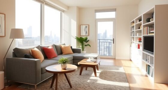
Ever wondered what makes a designer’s look effortlessly stylish? It often comes down to simple yet powerful principles that guide their choices behind the scenes. One of the most fundamental secrets is the Rule of Three. This rule isn’t just about grouping objects or colors; it’s a way to create harmony and visual interest without overwhelming the eye. When you choose your color palettes, stick to three main hues—like a dominant, a secondary, and an accent color. This combination ensures your space feels cohesive and balanced. Using more than three colors can make a room look chaotic, while fewer can feel sparse. Think of a room with a soft beige, muted teal, and warm terracotta accents. These three work together seamlessly to create a pleasing environment that feels curated but not cluttered.
Stick to three main colors for a cohesive, balanced, and stylish space.
Beyond color, furniture arrangements play a vital role in how effortlessly stylish a space appears. Designers swear by creating focal points and grouping furniture in threes or odd numbers. For example, a sofa flanked by two chairs or three side tables can anchor a room naturally, guiding the eye around the space. The Rule of Three in furniture arrangements helps establish a rhythm that’s easy to follow, making the room feel intentional and well-thought-out. Avoid placing all your furniture against the walls; instead, bring pieces closer to the center to foster conversation and intimacy. This arrangement not only looks inviting but also feels balanced and purposeful. When you plan your layout, think in threes—three lamps on a sideboard, three decorative objects on a coffee table, or three artworks on a wall. These groupings create visual stability and prevent your space from feeling disjointed. Additionally, understanding contrast ratio can help you select lighting and decor that enhance the overall aesthetic and ambiance.
In addition to the Rule of Three, designers emphasize maintaining a sense of proportion and scale. When selecting furniture or decor, consider the size of each piece relative to the room. Larger items should balance smaller accents to keep the space feeling harmonious. They also suggest editing your decor regularly—removing excess to avoid clutter and allow each element to shine. This minimal yet intentional approach makes your space look polished without appearing overdone.
Ultimately, the secret to effortless style lies in simplicity and balance. Whether you’re choosing a color palette or arranging furniture, sticking to these core principles helps you craft a space that feels both sophisticated and welcoming. The Rule of Three, combined with thoughtful proportions and arrangements, ensures your design feels natural and visually appealing—proof that sometimes, less truly is more.
Frequently Asked Questions
How Did the Rule of Three Originate in Design?
You might find that the rule of three originated in ancient storytelling and art, where grouping elements in threes creates visual balance and aesthetic harmony. Designers adopted this principle because our brains naturally find three parts more engaging and pleasing. By using three items or ideas, you can create a sense of completeness and rhythm in your design, making it more memorable and visually appealing.
Can the Rule of Three Be Applied to Digital Layouts?
Did you know that layouts with three focal points are 60% more engaging? You can definitely apply the rule of three to digital layouts. It helps create visual balance by organizing elements into groups of three, guiding viewers’ eyes naturally. Use this technique to emphasize key messages or images, ensuring your design feels harmonious and focused. It makes your digital content more appealing and easier to navigate.
What Are Common Mistakes When Using the Rule of Three?
You often face balance issues or overuse pitfalls when applying the rule of three. To avoid these mistakes, make certain your elements aren’t too clustered or unevenly spaced, which can disrupt visual harmony. Don’t rely solely on the rule without considering the overall layout. Overusing the principle may make your design predictable or dull. Instead, balance it with variety and intentional placement to create engaging, well-structured compositions.
Are There Cultural Differences in Styling With the Rule of Three?
Cultural interpretations and regional aesthetics shape how you apply the rule of three, much like a painter choosing colors for a landscape. In some cultures, symmetry and balance are prized, making the rule more straightforward, while others favor asymmetry and bold contrasts. You need to adapt your styling approach based on these differences, respecting local tastes and traditions to create designs that resonate deeply and feel authentic across diverse cultural contexts.
How Do I Adapt the Rule of Three for Small Spaces?
To adapt the rule of three for small spaces, focus on maintaining proportion and balance to create visual cohesion. Use three related items at different heights or sizes to avoid clutter and keep the area feeling open. Limit your grouping to avoid overwhelming the space, and choose items with complementary colors or textures. This approach guarantees your small space feels thoughtfully styled without sacrificing openness or harmony.
Conclusion
Just like a master painter uses the rule of three to create harmony, you can craft your space with these timeless secrets. Think of your design as a symphony, where each element plays its part in perfect balance. When you apply these tricks, your space transforms into a masterpiece—simple yet striking, like a well-composed poem. Trust these secrets, and watch your style soar, turning everyday moments into something truly artful.