
To make your home look effortlessly pulled together, focus on a mix of neutral palettes and bold accents. Use soft grays or creamy whites as a calming base, then add deep blues or vibrant reds for personality. Balance warm and cool tones in different spaces to create cozy vibes. You can also experiment with monochromatic schemes for a sophisticated touch. Incorporating contrasting colors adds energy, making your home lively. There’s so much more to explore on achieving that perfect look!
Key Takeaways
- Start with a neutral palette as a foundation, allowing for versatile accent colors that create a cohesive look throughout the home.
- Incorporate bold accents like deep blues or vibrant reds to add personality and energy to various spaces without overwhelming them.
- Use warm tones in living areas for a cozy feel and cool shades in bedrooms for a refreshing contrast, balancing ambiance effectively.
- Experiment with monochromatic schemes by varying shades of one color to create depth and harmony, enhancing the overall aesthetic.
- Pair contrasting colors thoughtfully, such as mint green with coral, to energize spaces while ensuring they complement each other for a pulled-together look.
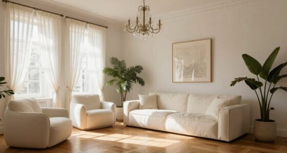
When you’re decorating your home, choosing the right color pairings can make all the difference in creating a cohesive look. You might start with neutral palettes, which serve as a perfect foundation. These colors, like soft grays or creamy whites, allow you to play with various accents without overwhelming the space. They create a calming backdrop, making your home feel inviting and serene.
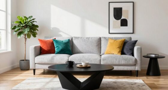
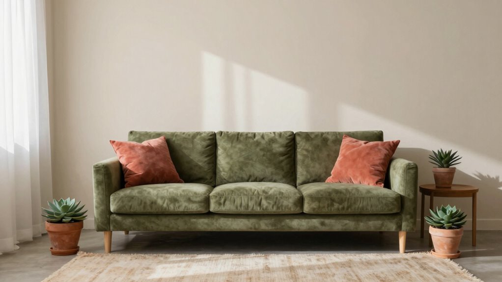
Once you’ve established your neutral base, consider integrating bold accents. A splash of deep blue or vibrant red can add personality and energy to a room. You don’t have to limit yourself to just one accent color; mixing bold shades can create a dynamic atmosphere, especially when paired with earthy hues like terracotta or olive green. These combinations can ground your space, making it feel more connected to nature.
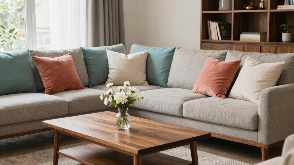
If you prefer a more subtle approach, think about warm tones and cool shades. Warm tones, such as rust or mustard, can create a cozy feel, while cool shades like teal or lavender offer a revitalizing contrast. You can balance these elements through careful placement; for instance, warm tones can dominate a living area, while cool shades might be more fitting in a bedroom for a restful ambiance. Incorporating color harmony principles can help achieve this balance effectively. Additionally, understanding how different hues interact can prevent unintended clashes and enhance your overall design scheme.
Monochromatic schemes also deserve a mention. Sticking to one color but varying the shades can create depth and richness. Imagine a room filled with varying shades of blue, from deep navy to soft sky; it’s visually striking yet harmonious. To keep things interesting, layer in rich textures like plush fabrics and smooth woods, which can enhance the monochromatic feel. Exploring color relationships can further refine your choices and ensure a cohesive look throughout your space.
Contrasting colors can add excitement, too. Think about pairing a pastel combination of mint green with a bold coral. This not only draws the eye but also creates a vibrant pop that can energize a dull corner. The key is to verify that the contrasting colors complement each other, making the space feel lively without clashing.
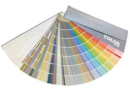
Sherwin Williams Colors collection Deck Complete Paint Colors
As an affiliate, we earn on qualifying purchases.
As an affiliate, we earn on qualifying purchases.
Frequently Asked Questions
How Do I Choose a Dominant Color for My Home?
To choose a dominant color for your home, start by exploring color psychology. Think about how different colors make you feel—blues can evoke calmness, while yellows bring energy. Gather design inspiration from magazines or online platforms to visualize how these colors interact in spaces. Test samples on your walls to see how they look in various lighting. Trust your instincts; the right color will resonate with your personal style and create the vibe you want.
Can I Mix Warm and Cool Colors Effectively?
“You can’t have your cake and eat it too.” But when it comes to mixing warm and cool colors, you absolutely can! By understanding color psychology, you can create a harmonious space. Warm colors energize while cool colors calm. To achieve color harmony, balance the two by using a dominant hue and accents from the opposite side. This way, you’ll create a vibrant yet cohesive atmosphere that feels inviting and well-thought-out.
What Is the Best Way to Test Paint Colors?
To test paint colors effectively, grab a few paint sample techniques. Start by applying swatches on your wall in different lighting throughout the day. This helps you see how colors change with light. Use a color swatch comparison to evaluate how each hue interacts with your space. Don’t hesitate to paint larger sections if needed; seeing the color in context really helps you decide what works best for your home.
How Do Lighting Conditions Affect Color Perception?
Lighting conditions markedly affect color perception. In natural light, colors appear more vibrant and true to their hue, while artificial light can alter their appearance. For instance, warm artificial lighting can make colors look softer, while cooler light can enhance their brightness. Consider the color temperature of your lighting; it can dramatically change how you perceive paint shades. Always test your colors in different lighting to see how they truly look throughout the day.
Are There Universal Color Rules for Small Spaces?
Yes, there are universal color rules for small spaces. Studies show that lighter colors can make a room feel up to 50% larger. This ties into color psychology, as soft hues enhance space perception by reflecting light. You’ll find that neutrals and pastels create an airy feel, while darker shades can make a room feel cozy but smaller. By choosing wisely, you can maximize your space‘s potential and achieve a harmonious vibe.

MIULEE Spring Mustard Yellow Throw Pillow Covers 18×18 Inch, Soft Plush Faux Wool Solid Couch Pillows Set of 2, Decorative Farmhouse Boho Cushion Covers for Sofa Living Room Bed Home Decor
Ideal Autumn Decoration: Perfect for cozy fall vibes in your bedroom, living room, couch, sofa, home office, patio,…
As an affiliate, we earn on qualifying purchases.
As an affiliate, we earn on qualifying purchases.
Conclusion
As you mix and match colors in your home, think of it like crafting a perfect playlist. Just as each song complements the next, creating a harmonious vibe, your chosen color pairings can transform your space. Studies show that well-coordinated colors can boost your mood by 30%. So, grab a brush and let your creativity flow—your home deserves a symphony of colors that sings with style and warmth!

CozyLux Queen Comforter Set Navy Blue, 7 Pieces Bed in a Bag, Blue Comforter Queen Size, All Season Bedding Sets with Stitch Quilted Comforter, Flat Sheet, Fitted Sheet, Pillowcases
PERFECT FOR ALL SEASONS: Made with premium microfiber filling and a quilted design for extra softness, volume, and…
As an affiliate, we earn on qualifying purchases.
As an affiliate, we earn on qualifying purchases.

Mymazn 48 Pack Glass Refrigerator Magnets for Fridge Cute Magnets Color Decorative Magnets for Office Locker Magnets for Whiteboard
Set of 48 pack, 4pcs magnets for each color.
As an affiliate, we earn on qualifying purchases.
As an affiliate, we earn on qualifying purchases.