TL;DR
House Beautiful’s interior design report highlights 17 colors that designers have paired with blue in rooms, from goldenrod and rust red to gray, lilac and brass. The examples offer palette ideas, but they are design guidance illustrated by specific homes—not a universal ranking or guarantee that every combination will work in every room.
House Beautiful has published a collection of interior design examples pairing blue with 17 other colors, including goldenrod, rust red, chartreuse, white, green and brass. The report presents the combinations through specific rooms and designers’ choices, offering readers palette ideas while emphasizing that the result depends on the blue shade and how colors are used together.

Get furniture and decor delivered free with Prime
- Fast, free delivery on millions of items
- Prime Video, Amazon Music and more included
- Member-only deals all year
The examples range from warm contrasts to quieter, closely related hues. In a San Francisco apartment, designer Caitlin Jones Ghajar used a warm yellow velvet bed frame against blue chinoiserie wallpaper. In a kitchen designed by Amber Lewis, duck-egg-blue cabinetry sits with rust-red and cream floor tiles. House Beautiful identifies the blue as Light Blue by Farrow & Ball, noting that it can appear almost gray in soft light.
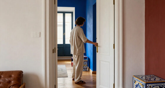
Other rooms show blue paired with black, chartreuse, tan, white and metallics. Black accents add depth to slate-blue cabinetry in a Woodstock, New York, kitchen by OAD Interiors. A French & French guest room combines light blue with chartreuse, while a bedroom by Serena Dugan uses golden-tan wallpaper alongside indigo details. In a lounge, French & French use a blue-and-white palette across patterns and surfaces.
The list also includes terra-cotta, mustard, peachy pink, grass green, ochre, gray, dark red, burnt orange, lilac and additional shades of blue. Some examples come from House Beautiful’s 2024 Whole Home, including a guest room in mustard and navy and a primary bedroom in cobalt, navy and ochre. The source describes the rooms and design decisions; it does not report a survey, controlled test or ranked assessment of the combinations.
How the Pairings Change a Room
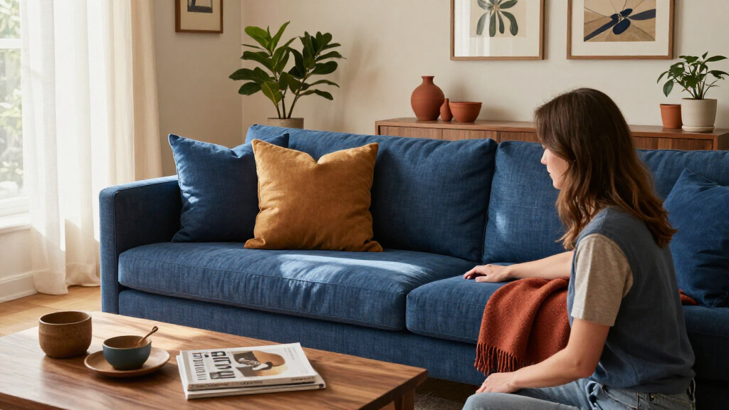
The report is useful to readers making decisions about paint, furnishings, wallpaper and accents: it shows that blue is not limited to white or other cool neutrals. Warm shades such as rust, ochre and burnt orange can create contrast, while green and lilac offer cooler combinations. Metallic details such as brass and bronze add reflective texture in the examples.
The rooms also suggest practical ways to manage intensity. House Beautiful notes that neutral bedding can ground bright mustard and navy, and that blue and gray can feel cohesive when they have similar levels of brightness. Those are design observations tied to the featured spaces, not guarantees; lighting, materials and the proportions of each color can affect the result.
Products Worth Considering

Philips Hue Play HDMI Sync Box 4K

Sonos Arc Ultra Soundbar with Dolby Atmos, Black

Levoit Eleva 300X Air Purifier for Home Bedroom
As an affiliate, we earn on qualifying purchases.
The Rooms Behind the Color Advice
The source is a House Beautiful interior design report illustrated with homes and rooms credited to designers and photographers. Its central approach is example-led: rather than naming one best match for every blue, it shows different pairings applied to cabinetry, walls, upholstery, tile, wallpaper and smaller accents.
Several suggestions are explained through color relationships. The report describes blue and yellow as a classic pairing, points to warm-versus-cool contrast, and recommends matching the brightness of blue and gray. It also presents monochrome blue as an option, using varying shades to create depth. These explanations provide a framework for interpreting the rooms, but the source does not establish a formal set of rules.
““This particular kind of blue lends itself really well to the vistas that are beyond, so you get some Bay view looks.””
— Caitlin Jones Ghajar, interior designer, as quoted by House Beautiful
What the Examples Cannot Establish
The report does not identify a single best color to pair with blue, rank its 17 options, or claim that every pairing works in any room. The headline’s broad wording is supported by varied examples, but the article itself describes particular rooms, shades and design choices. It offers no measurements of color performance, reader testing or evidence that one palette is preferred by designers overall.
Some guidance is subjective. The source does not provide a complete paint specification for every example, nor does it explain how the colors would appear under different lighting or with different finishes. Readers should treat the combinations as inspiration rather than a universal formula; the best choice for a particular space remains a matter of its conditions and the desired look.
Applying the Ideas at Home
Readers can use the examples to narrow down a palette, then test specific shades in the room where they will be used. A practical starting point is to choose the blue first and decide whether the goal is warm contrast, a restrained neutral pairing or a layered monochrome look. The report’s examples show how accent colors can appear in a bed frame, tile, wallpaper, curtains or metallic details rather than covering every surface.
Before committing to paint or large furnishings, compare samples in the room’s actual lighting and alongside existing materials. House Beautiful’s report does not announce a follow-up study or further findings, so no additional milestone is specified in the supplied material.
Key Questions
Which colors does House Beautiful show paired with blue?
The report features 17 pairings, including goldenrod, rust red, black, chartreuse, golden tan, white, bronze, terra-cotta, mustard, peachy pink, grass green, ochre, gray, dark red, burnt orange, lilac and other shades of blue. Brass also appears as a metallic accent.
Does the report name one best color for every shade of blue?
No. It presents examples from particular rooms and designers, not a universal ranking. The pairings vary with the shade of blue, surrounding colors and design choices.
What are some warm colors shown with blue?
Examples include goldenrod, rust red, golden tan, mustard, ochre and burnt orange. The report shows these in furnishings, tile, wallpaper and other accents.
What does the report suggest about blue and gray?
It describes blue and gray as a timeless, spa-like palette and says to keep the hues at a similar brightness level, such as pairing light blue with light gray. This is guidance from the report, not a guarantee for every room.
Source: housebeautiful.com