
To mix and match patterns like a pro, start by choosing a statement pattern as your anchor. Balance bold prints with subtle ones by varying sizes and using neutral colors to unify the look. Incorporate textures and layered proportions to add depth, and use accessories to highlight your style. Keep contrasts intentional, and don’t be afraid to experiment. If you want to master the secret formula, exploring these tips further will help you create polished, cohesive outfits.
Key Takeaways
- Start with one dominant, bold pattern and add smaller, subtler prints to create visual hierarchy.
- Use the color wheel to select harmonious hues or contrasting shades for intentional pattern pairing.
- Balance large and small patterns by varying scale and proportion to avoid overwhelming the look.
- Incorporate neutral colors as anchors to unify different patterns and provide visual rest.
- Experiment with textures and layering to add depth and interest without clashing.
Understanding Pattern Scales and Sizes

To effectively mix and match patterns, you need to understand the importance of scale and size. Recognizing scale contrast helps you create visual interest, making some patterns stand out while others recede. Larger patterns draw attention and serve as focal points, while smaller ones add subtle detail. Mastering pattern hierarchy ensures your design feels balanced; you want a clear flow from dominant patterns to supporting accents. When combining patterns, vary their sizes intentionally—pair a bold, large print with a delicate, small one to avoid overwhelming the space. This contrast in scale keeps the eye moving and prevents clashes. Paying attention to pattern hierarchy and scale contrast—both key concepts in design harmony—will help you develop a cohesive, dynamic look that feels intentional and polished. Additionally, understanding market trends and how they influence design choices can inspire fresh combinations and ensure your patterns stay current. Incorporating seasonal updates can also keep your pattern mix feeling fresh and aligned with current styles. Being aware of AI-driven trends in fashion and home decor can further refine your choices to stay ahead of the curve, and exploring visual balance principles can help you fine-tune your pattern arrangements for optimal harmony.
Choosing a Unifying Color Palette
Start by selecting complementary hues that create harmony without clashing, making your patterns feel connected. Incorporate neutral colors as anchors to balance bold or busy prints and keep the overall look cohesive. When you unify your palette, mixing patterns becomes effortless and visually appealing. Utilizing color harmony principles can further enhance the cohesive look of your patterns. Additionally, understanding how color temperature affects the overall aesthetic can help you create more dynamic and balanced combinations. Recognizing the role of contrast levels can also guide you in achieving more visually engaging pattern mixes. Embracing artistic expression can inspire more creative and personalized pattern pairings, especially when considering how visual balance impacts overall harmony in your design.
Select Complementary Hues
Choosing a unifying color palette begins with selecting hues that complement each other harmoniously. The color wheel is your best tool for this, helping you identify shades that work well together. Look for colors opposite each other, like blue and orange, for striking contrast, or adjacent hues, such as yellow and green, for subtle harmony. Focus on hue harmony to ensure your patterns don’t clash but instead create a balanced visual flow. When you pick complementary hues, you establish a cohesive foundation for your mix-and-match design. This approach allows you to incorporate multiple patterns confidently, knowing the colors support and enhance one another. Remember, the key is to choose hues that resonate and unify your overall look without overwhelming it. Additionally, maintaining a sense of visual simplicity can help prevent your patterns from becoming overly busy or chaotic. Being mindful of color contrast ensures your patterns stay harmonious and pleasing to the eye. Incorporating principles like contrast ratio from projector technology can further help you maintain clarity and visual balance across your patterns.
Use Neutral Anchors
Neutral anchors serve as a subtle foundation that unifies your pattern mix, making bold colors and intricate designs feel cohesive rather than chaotic. Using neutral color schemes—like beige, gray, or soft whites—creates a versatile pattern pairing that balances busy prints with calmer tones. This approach allows you to experiment freely, mixing florals with stripes or geometric patterns without overwhelming the space. By anchoring your design with neutral elements, you provide a visual rest that ties everything together seamlessly. Neutral anchors also make it easier to update your decor over time, as they act as a versatile backdrop for accent colors and textures. Incorporating knowledge from speech therapy techniques, such as visual cues and consistent feedback, can serve as visual and auditory cues to enhance the overall harmony of your pattern combinations. Additionally, understanding how to balance visual interest can help you create a cohesive and aesthetically pleasing decor scheme. Recognizing the importance of visual organization can further improve how your patterns complement each other, ensuring a polished look. Moreover, paying attention to color harmony can strengthen the unified appearance of your design, and integrating cognitive organization techniques can improve your overall pattern arrangement for a more balanced aesthetic.
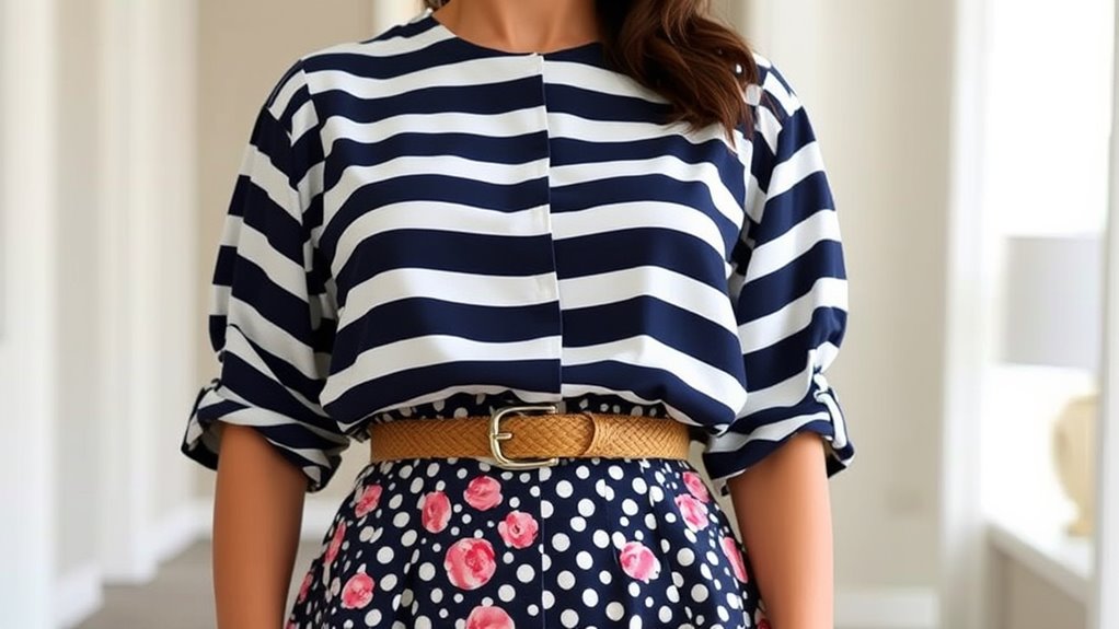
Starting With One Statement Pattern
To create a striking pattern mix, it’s best to begin with one statement piece that anchors your look. This approach helps you avoid common pattern mixing myths, like the idea that all patterns must match perfectly. Instead, focus on a bold, eye-catching pattern that sets the tone for your outfit. Historically, pattern trends have shown that mixing a single statement pattern with complementary pieces creates a balanced, stylish effect. Keep in mind that starting with one dominant pattern allows you to experiment confidently, knowing you have a solid foundation. From florals to stripes, pick a pattern that resonates with your style and build around it. This method simplifies the process and keeps your look cohesive without clashing. Incorporating free floating elements can also add an effortless touch to your overall style, and understanding pattern harmony can guide you in selecting the right combinations. Developing an awareness of visual balance will further enhance your ability to mix patterns successfully, especially when considering color coordination to tie different patterns together seamlessly.
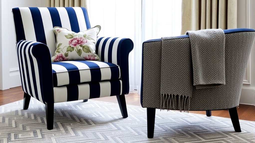
Combining Complementary and Analogous Patterns
When combining complementary and analogous patterns, you’ll want to focus on how these patterns work together to create harmony. The key is applying pattern pairing principles that emphasize balance and cohesion. Complementary patterns, which sit opposite each other on the color wheel, add vibrancy and contrast, while analogous patterns, adjacent on the wheel, bring subtlety and flow. To achieve visual harmony, choose one pattern as your dominant element and use the other as an accent. Keep color schemes consistent and vary scale to prevent clutter. This approach assures your pattern pairing feels intentional and polished. Understanding color wheel relationships helps you select patterns that naturally complement or flow into each other, enhancing your overall design. Additionally, paying attention to visual balance ensures your pattern combinations do not feel overwhelming or disjointed. Incorporating pattern scale is also crucial, as varying the size of patterns can create depth and interest without overwhelming the eye. Recognizing the importance of risk management strategies from the context of investments reminds us to consider balance and safety in every aspect of design. By understanding how these patterns complement and support each other, you create a dynamic yet cohesive look that feels both lively and coordinated.
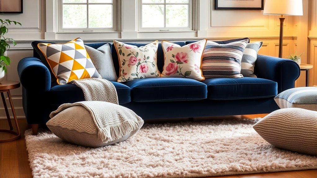
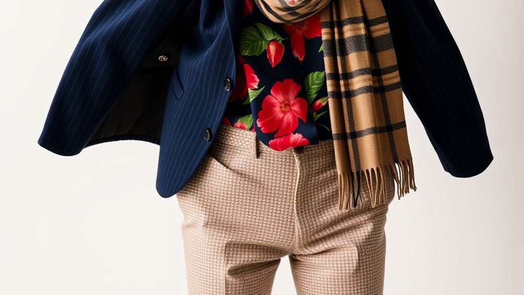
Balancing Bold and Subtle Prints
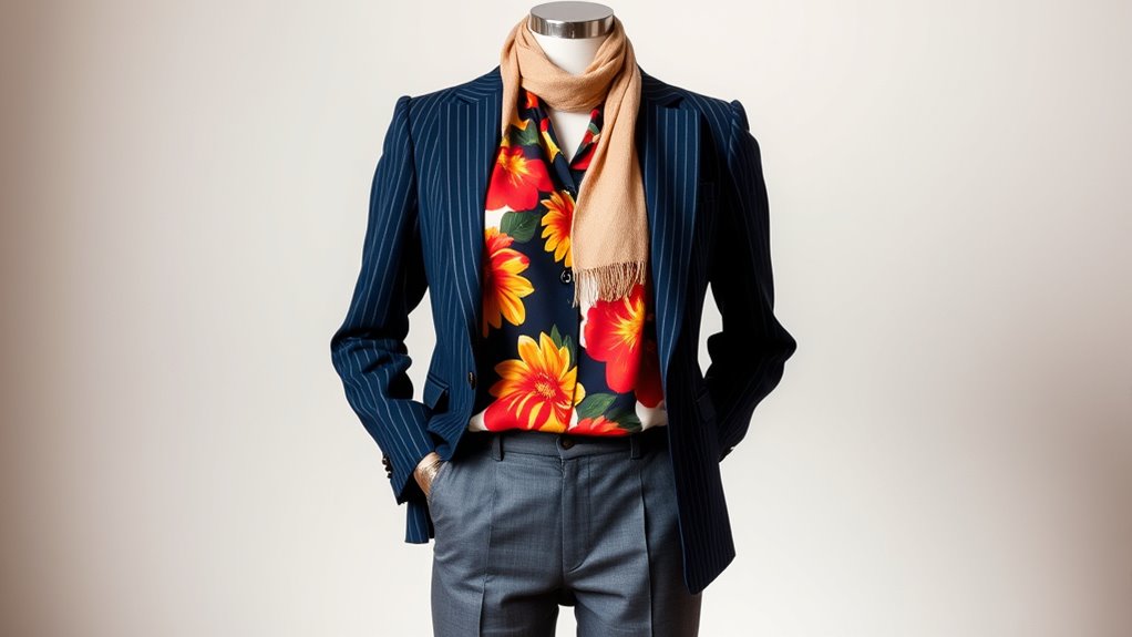
To create a balanced look, you should pair bold prints with more subtle ones to avoid overwhelming your outfit. Neutral pieces, like beige or gray, act as anchors and help ground your look. This combination keeps your outfit interesting without feeling chaotic.
Pair Bold With Subtle
Balancing bold and subtle prints can instantly elevate your outfit without overwhelming your look. Many fall for pattern mixing myths, thinking every print must clash or complement wildly. Instead, pairing a bold print with a subtle one creates harmony, highlighting your style confidently. Cultural pattern influences remind us that mixing patterns isn’t just modern; it’s rooted in tradition and storytelling. Use this to inspire your choices, blending intricate designs with simple, understated pieces. Here’s an emotional guide to pairing:
| Bold Prints | Subtle Prints | Emotional Impact |
|---|---|---|
| Vibrant florals | Soft stripes | Confidence |
| Bright geometric | Light polka dots | Playfulness |
| Rich animal prints | Gentle textures | Sophistication |
| Bold abstract | Minimalist patterns | Balance |
| Statement motifs | Delicate accents | Elegance |
Use Neutral Anchors
Neutral anchors are essential when mixing bold and subtle prints because they provide a stable foundation that ties your look together. Using neutral color schemes, like beige, gray, or soft whites, helps balance out busy patterns and prevents the outfit from feeling overwhelming. Incorporate understated pattern accents, such as thin stripes or small polka dots, to add visual interest without competing with larger prints. These subtle details serve as connectors, creating harmony between contrasting patterns. Neutral anchors make it easier to experiment with different prints, giving your outfit a polished, cohesive feel. When in doubt, start with a neutral base and build your pattern mix around it. This approach ensures your look remains stylish, balanced, and effortlessly chic.
Playing With Texture and Fabric Types
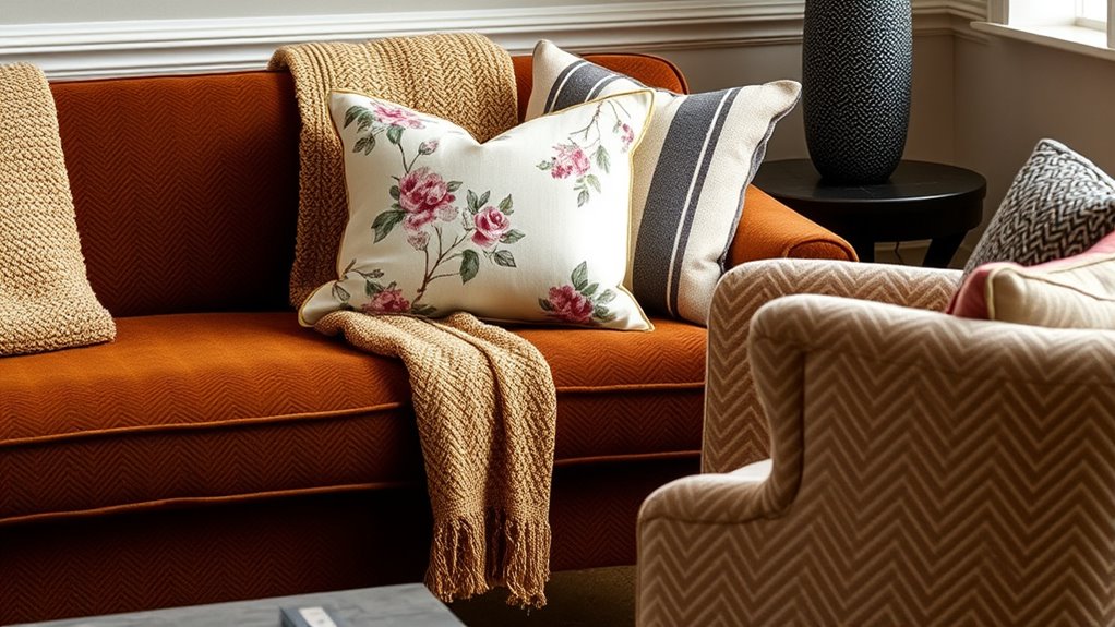
Experimenting with different textures and fabric types adds depth and interest to your pattern mixes, making your outfits more dynamic and visually appealing. Achieving successful fabric mixing involves creating compelling textural contrast, which highlights each piece’s unique qualities. To master this, consider these strategies:
- Mix smooth fabrics like silk with rougher textures such as tweed or boucle for a tactile surprise.
- Combine lightweight materials like cotton with heavier fabrics like denim to add dimension.
- Pair matte finishes with glossy or metallic fabrics to elevate your look through subtle contrasts.
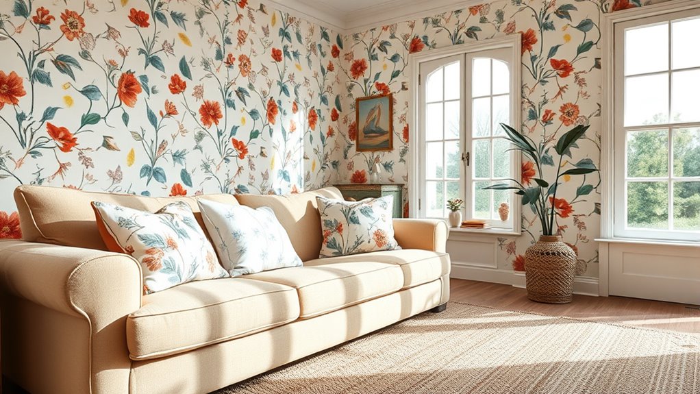
Using Neutrals to Tone Down Patterns

When you want to keep your outfit from becoming overwhelming, using neutrals to tone down bold patterns is a smart move. Neutral color schemes, like beige and gray, act as a balancing backdrop that lets your patterns stand out without clashing. Incorporate these shades into your clothing or accessories to create a harmonious look. For example, pair a busy patterned top with beige pants or a gray skirt to reduce visual chaos. Neutrals also provide versatility, making it easier to mix different patterns without overwhelming your overall style. They serve as a calming anchor, allowing you to experiment with bold prints while maintaining a polished, cohesive appearance. Using neutral tones strategically helps you achieve a stylish, balanced outfit every time.
Incorporating Patterned Accessories
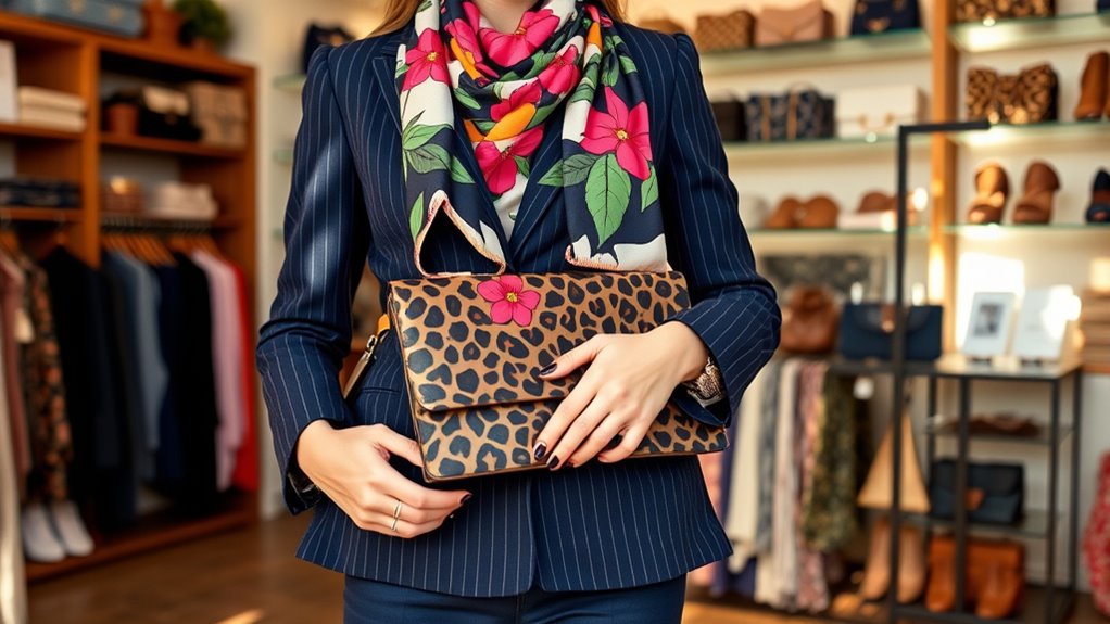
Adding patterned accessories is a great way to elevate your outfit without overwhelming it. They add visual interest and show your style confidence. To do this effectively, focus on accessory color coordination. First, select a patterned accessory that complements your main colors; for example, a scarf with subtle floral patterns and soft hues. Second, balance bold patterns with simpler pieces—like pairing a patterned handbag with a plain dress. Third, consider the scale of the patterns: mix larger, statement accessories with smaller, delicate ones for harmony. By thoughtfully choosing patterned accessories and paying attention to accessory color coordination, you create a cohesive look that’s stylish yet balanced, ensuring your patterns work together rather than clash.
Experimenting With Layering and Proportions
Building on your accessor choices, playing with layering and proportions can take your patterned outfits to the next level. Use layering techniques to create depth and visual interest, such as pairing a striped shirt under a patterned blazer. Adjust proportions by balancing larger prints with smaller ones, ensuring no pattern overwhelms your frame. Experiment with proportion adjustments by cinching your waist with belts or tucking in tops to highlight your shape. Varying the lengths of layered pieces keeps your look dynamic, while mixing textures can add contrast without clashing. Keep in mind that subtle differences in scale help patterns coexist harmoniously. By carefully adjusting proportions and employing layering techniques, you’ll craft stylish, cohesive outfits that confidently showcase your pattern-mixing skills.
Frequently Asked Questions
How Do I Avoid Pattern Overload in a Room?
To avoid pattern overload, focus on balancing pattern scale and color coordination. Use larger patterns sparingly to create focal points, while smaller patterns add visual interest without overwhelming. Stick to a cohesive color palette to unify different patterns and keep the room looking harmonious. Limit yourself to two or three patterns, mixing textures and shades thoughtfully, so your space feels lively yet balanced and inviting.
Can Mixing Patterns Work in Small Spaces?
Mixing patterns in a small space is like seasoning a dish—you want just enough to enhance, not overwhelm. You can absolutely do it, as long as you pay attention to pattern scale and color coordination. Opt for smaller or more subtle patterns that won’t overpower the room, and keep a consistent color palette. This balance creates visual interest without making your space feel cluttered or chaotic.
What Are the Best Patterns to Combine for Beginners?
For beginners, start with classic patterns like stripes and polka dots, which create a balanced look. Focus on texture contrast to add interest and keep color harmony in mind, choosing patterns with complementary shades. Mix small-scale patterns with larger ones to avoid overwhelming your space. Keep the overall palette cohesive, and don’t be afraid to experiment—your confidence will grow as you learn to balance different designs effortlessly.
How Do Patterns Influence the Overall Mood of a Space?
Think of patterns as the mood setters in your space, much like a painter choosing colors for a masterpiece. Pattern psychology reveals how different designs evoke emotions—bold stripes energize, while soft florals soothe. Proper color coordination and pattern choices transform your room’s atmosphere, making it lively, calming, or sophisticated. So, you control the vibe, and with mindful pattern pairing, you create an environment that feels just right for you.
Are There Specific Patterns to Avoid Pairing Together?
You should avoid pairing incompatible prints or engaging in pattern clashing, as it can create visual chaos. Steer clear of mixing busy patterns with similarly bold designs or combining prints that clash in scale or color. Instead, opt for a balanced approach by pairing a bold pattern with a subtle or neutral print. This helps you achieve a harmonious look without overwhelming the space or attracting unwanted attention.
Conclusion
Now that you know the secrets to mixing patterns like a pro, you’re ready to turn your wardrobe into a vibrant tapestry. Think of patterns as spices—use them thoughtfully, and you’ll create a dish that’s both exciting and harmonious. Don’t be afraid to experiment and trust your instincts; after all, fashion is your canvas. With a little practice, you’ll be weaving styles together effortlessly, creating looks that are uniquely, beautifully you.